Kami and Margret’s cover for Beautiful Creatures is another prime example that less is sometimes more. The photo negative effect given to the trees give the whole cover and eerie feel, which I adore, and the fact that the path cutting through the forest leads into a dark void is an excellent use of foreshadowing one of the main conflicts in the novel. The title looks amazing. Purple is one of my favourite colors and making the letters seem as if someone drew a toothpick threw wet paint makes the whole title seem appropriately magical. Beautiful Creatures is after all, a book about witches.
Dead beautiful by Yvonne Woon
Forests can be portrayed in many magical ways. Scary, peaceful, odd, and sometimes gloomy. The cover for Dead beautiful has almost all of these qualities and its magnificent. I personally adore this cover. The cover draws you in, in many ways. The girl in the centre of the cover is beautiful and you can tell she is independent, and she seems detached in some way. The forest is like I said before, beautiful and peaceful, yet odd and gloomy. I believe this cover was an excellent choice, and an excellent cover to gush over!
Sweetly by Jackson Pearce
I love Jackson Pearce’s cover for her upcoming novel Sweetly. For those of you who are not familiar with this book is a modernized version of Hansel and Gretel. The setting and events are drastically changed, but the main evil witch who lives in a forest and preys on children with a hankering for sweets stays the same. Anywho, back to the cover. I love how the forest was designed to form the witch’s face; this personifies a vast number of tree metaphors. The branches even form a sinister smile that draws attention to the house below it. A house, owed by a sinister witch, in the middle of a creepy forest...where no one can hear you scream.
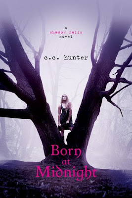
Born at Midnight by C.C. Hunter
I can’t stop staring at this cover. First off, the fog in the background was a clever instrument used to create an aura of mystery around the novel and not to mention the faint outline of trees was a nice touch as well! I also really like the font of the title and I’m not usually a ‘pink’ kind of girl, but I’ll admit it goes nicely with the cover. The main character, Kylie is seen standing in between the fork in the trees and I personally think this is symbolism that reflects the plot of the story. It could hint that some of her feelings could lead to two different choices that she will have to make in the book! I also like how the single tree trunk split off into two individual trees—an interesting tactic and possibly another hint at the plot? Methinks so!
Shiver by Maggie Stiefvater
There is a lot to love about Maggie Stiefvater's cover for Shiver. I love how everything on the cover is blue except for the novel’s boldly black title and the small splatter of blood that forms the I’s tittle or dot. The use of different shades of blue to create a layered look to the forest is a unique idea that gives the cover a 3D effect and the fact that the shades are classified as cool or cold coulours is ironically clever considering the title. Lastly I adore the wolf and how he seems to be watching from the forest. For those of you who aren’t familiar with Shiver’s stories line; the novel is about a werewolf who falls in love with the human he’s been watching for years. It’s all so romantic and gush worthy


3 comments:
These are all really pretty!
Have you seen the cover for Carrier of the Mark? I was blown away. Covers are getting so artistic these days!
I love the cover for Carrier of the Mark! I'm going to feature it in an upcoming CTGO soon C:
OMG!!! I am in llllllloooooooovvvvvvvvveeeeeeeee with the cover of DEAD BEAUTIFUL!!! Thanks for showin it to me! :)
Post a Comment